projects


print/digital marketing︎︎︎
 just for fun︎︎︎

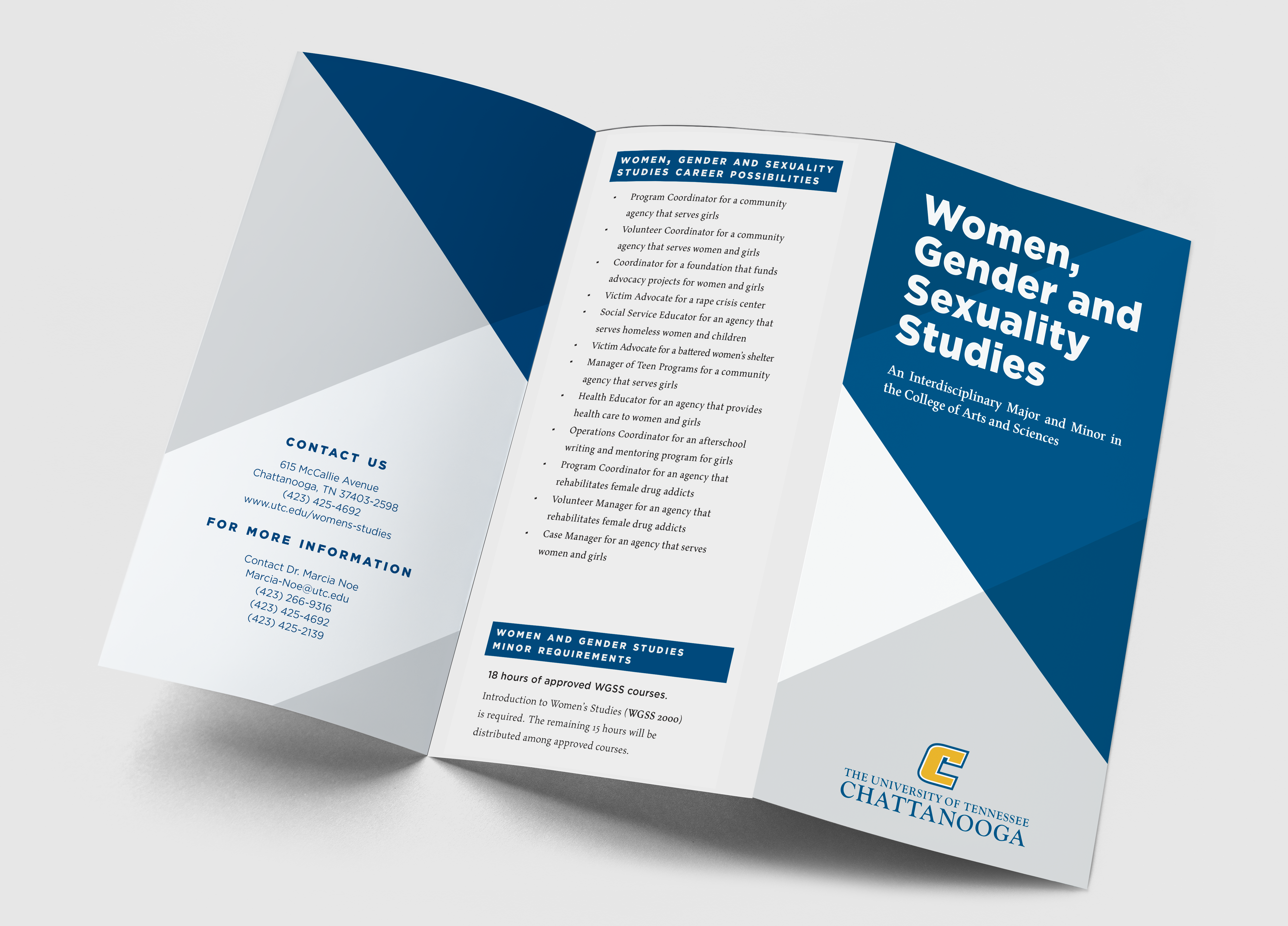
My Care Compass Health
Brand Design / Healthcare
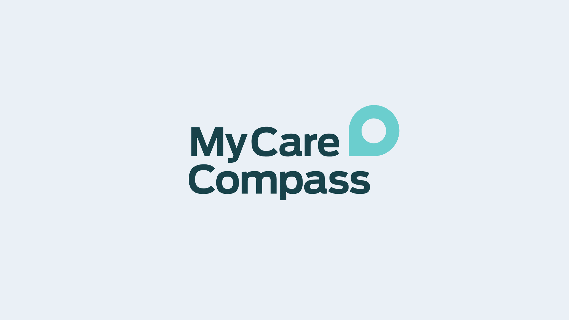
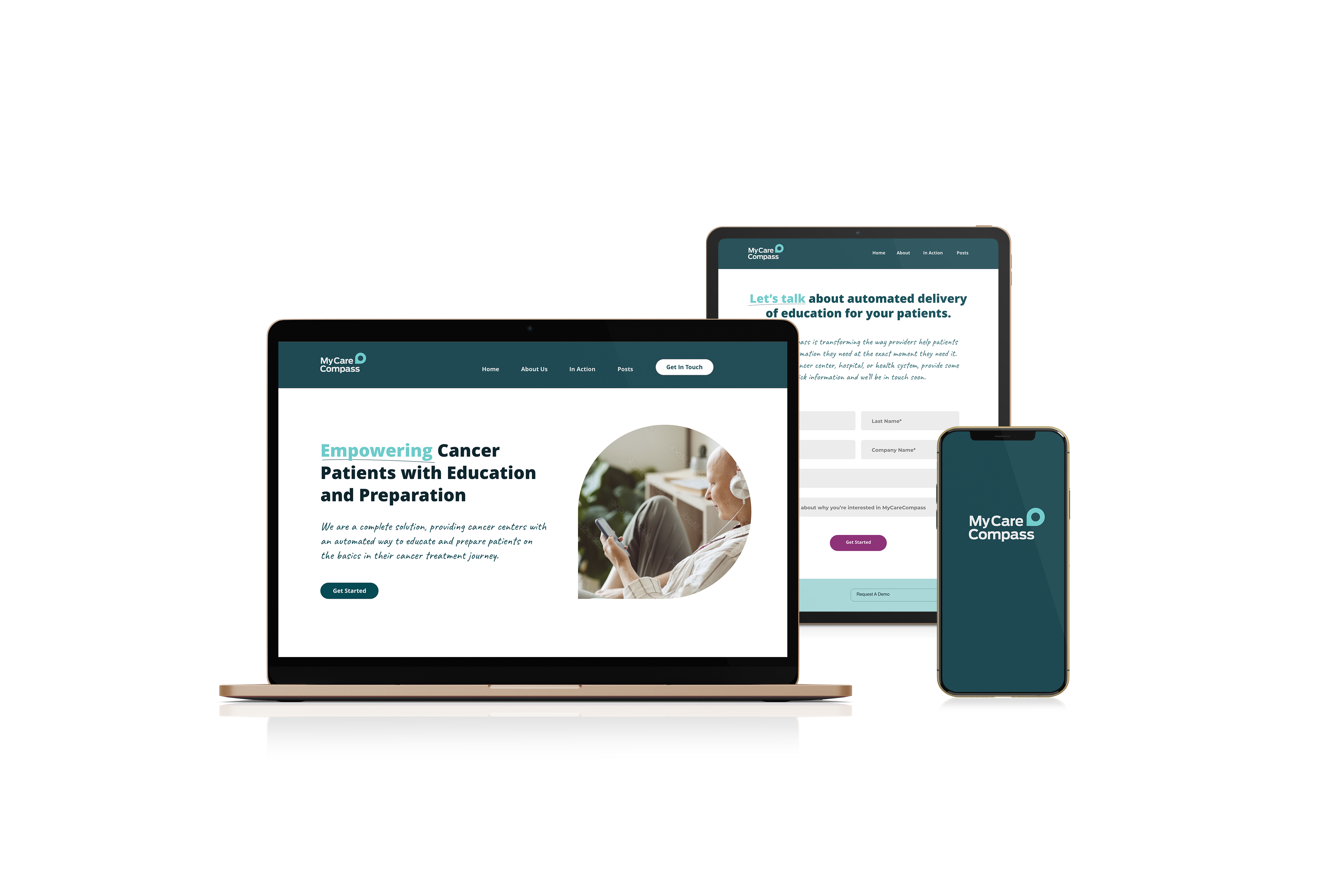
My Care Compass Health is a comprehensive oncology patient education system built around clarity, empathy, and accessibility. I developed the full brand identity from the ground up: logo, brand guidelines, color system, typography, website, and digital and print assets.
The central design challenge was building something that felt warm and trustworthy without being clinical or sterile, a common pitfall in healthcare branding. The compass logo was a deliberate answer to that: navigation through uncertainty, grounded and reassuring rather than cold or corporate. The color system followed the same logic, steering away from the typical medical blues toward a palette that felt human and approachable.
Within the first year of launch, the brand supported a partnership with a major hospital system, a strong signal that the identity resonated with the right audiences.
This project reflects how I approach brand work: every visual decision tied back to who the user is, what they need to feel, and what the brand needs to communicate.
Brand Design / Healthcare
My Care Compass Health is a comprehensive oncology patient education system built around clarity, empathy, and accessibility. I developed the full brand identity from the ground up: logo, brand guidelines, color system, typography, website, and digital and print assets.
The central design challenge was building something that felt warm and trustworthy without being clinical or sterile, a common pitfall in healthcare branding. The compass logo was a deliberate answer to that: navigation through uncertainty, grounded and reassuring rather than cold or corporate. The color system followed the same logic, steering away from the typical medical blues toward a palette that felt human and approachable.
Within the first year of launch, the brand supported a partnership with a major hospital system, a strong signal that the identity resonated with the right audiences.
This project reflects how I approach brand work: every visual decision tied back to who the user is, what they need to feel, and what the brand needs to communicate.