projects


print/digital marketing︎︎︎
 just for fun︎︎︎
Data Visualization Blog
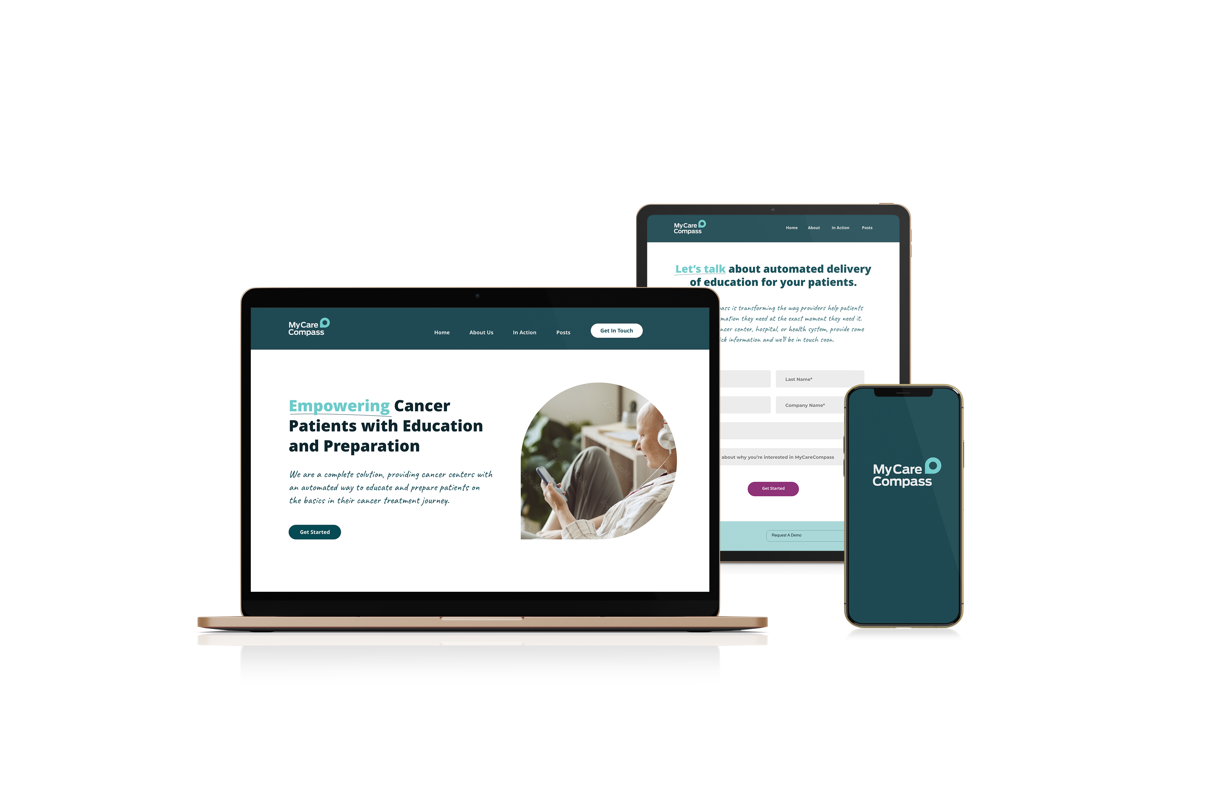
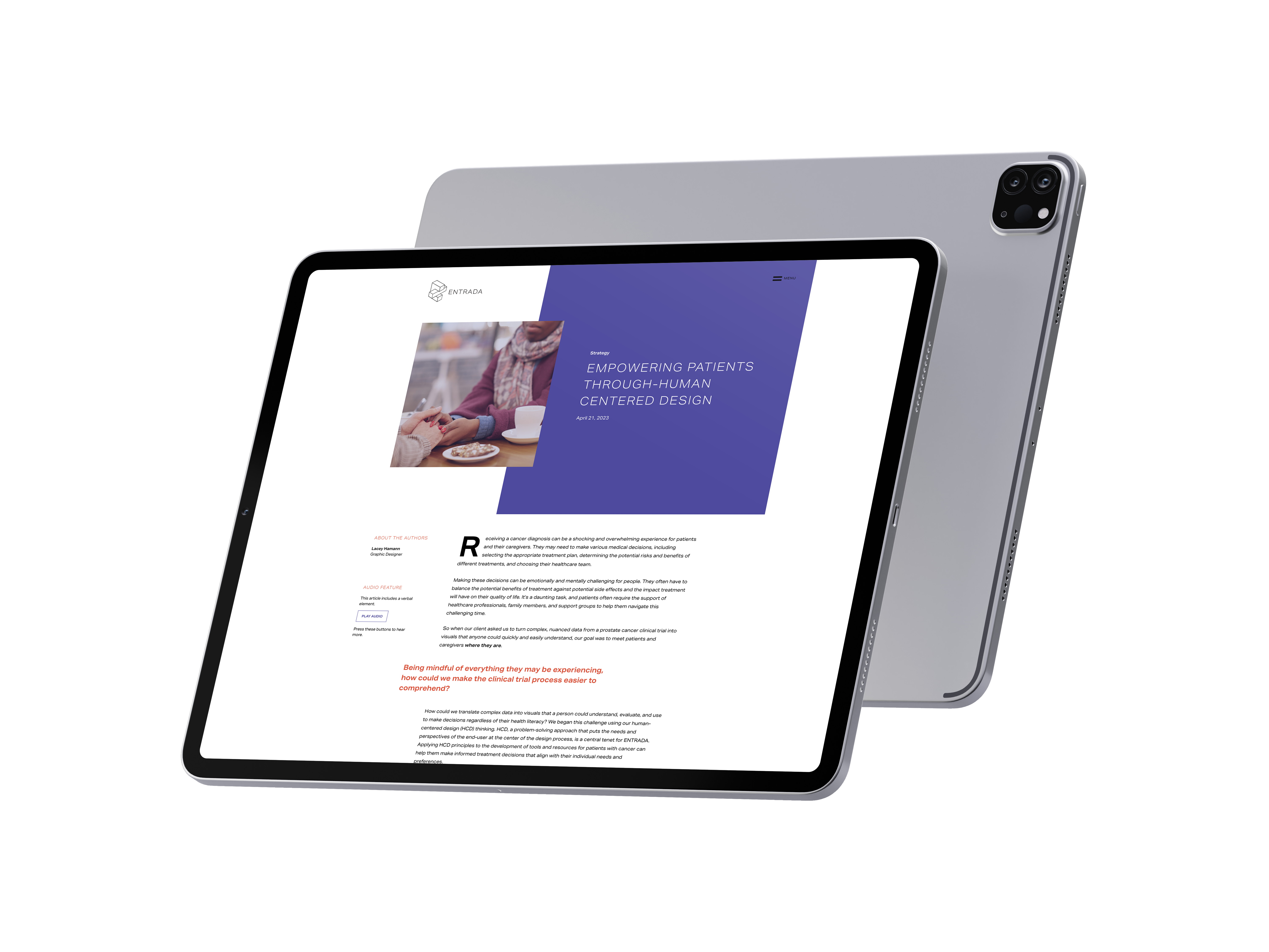
Web Design & Copywriting / Healthcare
This project asked a hard design question: how do you present complex medical data to patients who are scared, overwhelmed, and not trained to read clinical charts?
I designed a webpage and companion blog post translating prostate cancer data into clear, accessible visualizations for patients and caregivers. The process included direct engagement with patients, caregivers, and medical professionals through test groups, which shaped every decision about language, hierarchy, and visual complexity.
The core challenge was trust. Medical data can feel cold and alienating when presented clinically. The design prioritized warmth and clarity over precision-for-its-own-sake, using plain language, approachable typography, and visualizations built around what patients actually needed to understand rather than what the data technically showed.
This project sits at the intersection of design, empathy, and healthcare communication, which is territory I find genuinely compelling.
