

print/digital marketing︎︎︎
 just for fun︎︎︎

Noms
Visual Identity–Print Collateral / 2020
The goal of Noms is to build dynamic, culturally-enhanced experiences for present-day drifters. With environmental sensitivity more important than ever, repurposing a roadside inn is a great way to reuse existing materials — especially when they come pre-loaded with a clearly defined visual character. I designed the Noms brand identity using inspiration from vintage motels and created a visual system which appeals to modern audiences looking for modern ammenities.
Drawing upon my passion for typography and design history, I delved into the world of vintage motel signage, studying iconic letterforms and stylistic elements that defined the era. From bold, retro fonts to playful iconography, I curated a collection of design elements that would pay homage to the motel's heritage while infusing it with a fresh, inviting appeal.
Through its successful implementation, the Noms logo not only enhanced the motel's overall branding but also contributed to a measurable increase in customer traffic. This tangible result underscores the power of thoughtful design in driving business success, demonstrating how a well-crafted logo can serve as a catalyst for growth and differentiation in a competitive market.
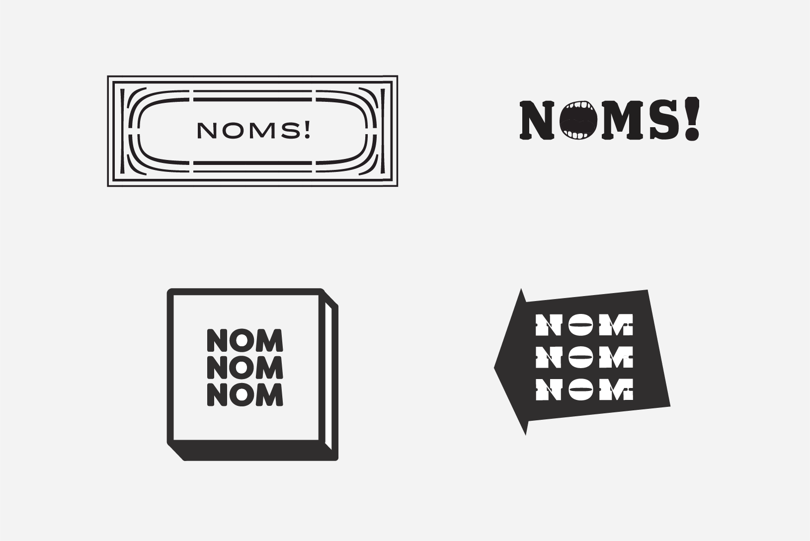
Logo Concepts
Final Logo
